Moody
A music streaming application that matches your music to your mood.
A 10-week project that tackles a solution to musical paralysis.
This was researched in part of my interest in music and the streaming space. I wanted to know more about certain trends and feelings that people had regarding finding new music, which led me to the discovery of musical paralysis. Musical paralysis is defined as the phenomenon of stopping the discovery of new music at around 28 years old. This was the key focus of my research and journey for my capstone project.
Project Length: 10 weeks
Project Type: App Design
Software used: Figma, InVision
The Problem
Problem Statement
In 2022, it is estimated that the amount of people who listen to music globally is at 90-93% with the music industry being one of the largest in the world generating around $25.9 billion in 2021. In a world with increasing choices, millennial music listeners have a difficult time discovering music due to their busy lifestyles. This was coined as ‘musical paralysis’ by Deezer, a music streaming service that conducted multiple surveys on why this occurs.
The initial survey found that 60% of participants wished they had more time to discover new music. Experiencing musical paralysis can be quite overwhelming, especially when hindered by the amount of music choices, busy workload, or raising children.
This helped me create an initial how might we statement:
How might we help millennial music listeners easily discover new music in order to overcome an overwhelming amount of choice and busy lifestyle?
Another survey from Deezer found that after asking 5000 individuals from France, the UK, Germany, USA, and Brazil
65%
only listened to tracks that they already know
60%
wanted to expand their music library
60%
yearned for more time to listen to new music
53%
wanted to set time apart in the future to seek out new artists
28
the age when musical paralysis hits
Interviews and Key Findings
Hypothesis
The hypothesis for my research was that I believe that Millennial music listeners suffer from musical paralysis due to the overwhelming amount of choices and not knowing how to begin expanding their musical library.
Participant Criteria
I initially interviewed three individuals with the following criteria:
Age
at least 26 (Millennial)
Occupation
Any
Requirements
Uses a music streaming service
Gender
Any
Location
North America
These are the interview questions I use to conduct the interviews via Zoom and in-person
-
How old are you?
-
What is your occupation and how long do you work per day?
-
Do you use music streaming services?
-
How often do you listen to music?
-
What are your preferred music genres?
-
How often do you look for new music?
-
Tell me a time when you tried to look for new music.
-
How do you usually find your music?
-
Why would you be hindered to look for new music?
-
Why do you listen to music?
-
How important is looking for new music to you?
Upon gathering the findings, I encountered difficulty in finding something concrete and substantial to go about really understanding the problem, so I did some follow-up interviews asking the following questions.
-
Why do you like hearing new songs?
-
What would motivate you to listen to new music?
-
How does music make you feel?
-
Tell me about a time you had a negative experience looking for new music.
-
Why do you think people don’t have time to look for new music?
-
How do you decide that you enjoy a song?
Affinty Mapping
From the interviews, I was able to categorize each interviewee’s responses into pain points, motivations, and behaviours and created a theme and insight statement from each to better understand the user’s journey with their current music experience.


These were then organized into different themes, in which insight statements were created to help develop a new how might we statement

The chosen theme is Mood and Feeling and the insight statement is that millennials find that music plays a big part in expressing and improving their mood, but find it difficult to find new music that they enjoy due to the availability of music being less appealing
How Might We Statement
How might we help millennial music listeners have easier access to new music in order to increase its appeal and enjoyment despite being busy?
Persona and User Stories
I created a persona based on the target group that expressed my possible users' pain points, motivations, behaviours, and personalities.
Meet Jonathan

Jonathan can be best described in three main points: Jonathan cannot find music to enjoy, he enjoys songs depending on how he is feeling, and he wants to hear new music but does not put much effort into searching.
User Stories
Crafting user stories helped me understand what it is that is lacking in the current field of music streaming and not aligned with the needs of the users.
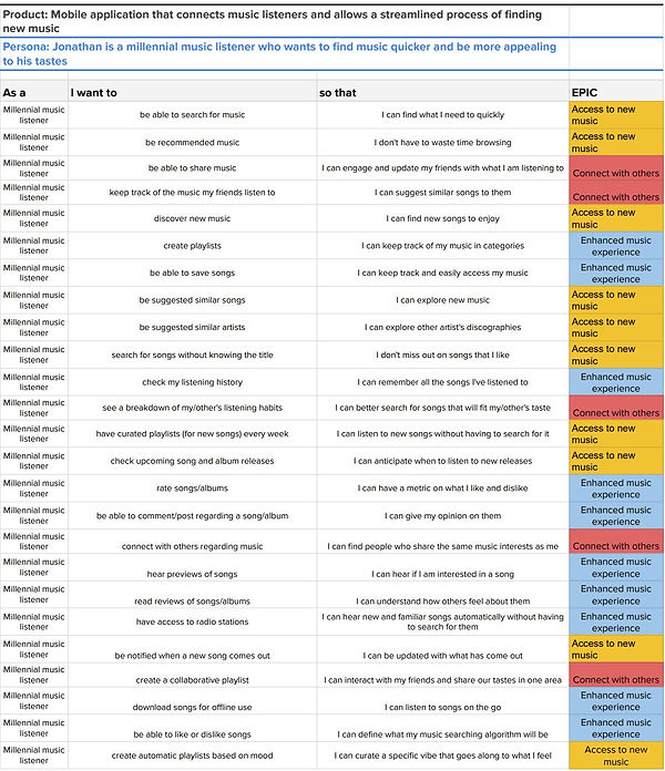
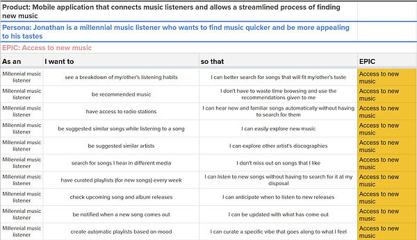
Ultimately, I decided on Access to new music as my core epic, which fundamentally helped me to understand how to craft my task flow. Notably, my interviews found the common link between having access to radio stations and being able to create playlists based on mood as features users want to have.
Task Flow
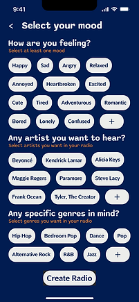
The task flow I decided to focus on was to see how users would generate a radio playlist based on their moods. The task is successful when the user is able to generate a radio playlist.
.jpg)
Sketches and Wireframes
After coming up with a task flow, it was time to start designing the app I had in mind. To start this process I did a series of exploratory sketches using my UI Inspiration board and task flow as a guide. This allowed me to come up with different ideas that could be potentially part of the app.

After deciding on which sketches to focus on, I worked on my solution sketches to loosely envision how the app would look like.


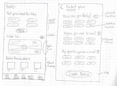

Using these sketches, I used them as a reference in creating my grayscale wireframes
Home Screen

Radio Screen

Mood Selection Screen

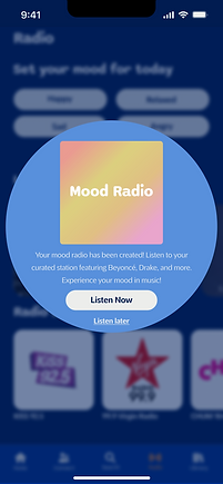
Pop-up Screen

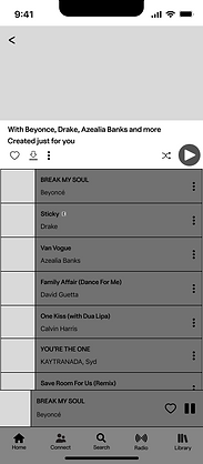
Playlist Screen

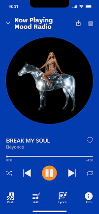
Music Player

Home Screen with song playing
.png)
Check it out on Figma!

User Testing
User testing was conducted with five individuals either in-person or virtually. The tasks given to the users in the form of scenarios are the following:
-
Task 1: “Scroll around the home page”
Scenario: Imagine that you are Jonathan and you want to look around the home screen, what would you do?
Goal: Be able to navigate the home screen
-
Task 2: “Select Radio”
Scenario: Jonathan feels like he wants to use the radio, what would you do next?
Goal: To see if users understand how to navigate between pages
-
Task 3: "Select "Select Mood""
Scenario: After looking at the Radio page, Jonathan decides he wants to create a radio based on his mood, how would you go about doing this?
Goal: To see if users can identify how to create a radio based on mood
-
Task 4: “Create a radio based on his mood”
Scenario: Jonathan is feeling very happy and excited and wants to listen to some Beyonce because he is in a dancing mood, how would you create a radio station?
Goal: To see if users can successfully pinpoint if buttons can be clicked
-
Task 5: “Select Listen Now”
Scenario: Now that the radio has been created, how would you go about accessing it?
Goal: To have users select Listen Now
-
Task 6: “Select BREAK MY SOUL by Beyonce or play button”
Scenario: Let’s say you want to start the playlist, what would you do?
Goal: To see if users can identify different ways to start the playlist
-
Task 7: “Go back to the home screen”
Scenario: After playing the song, you want to continue browsing the home page. How would you go about doing that?
Goal: To see if users can identify how to minimize the song and go back to the home screen
The feedback received from the users was compiled and placed in the form of a design prioritization matrix to make sense of the feedback and how to apply it to the next iteration of the prototype.

1st round of Testing

2nd round of Testing
Final MidFi Prototype
This is the final prototype after the two rounds of user testing.
Home Screen
Playlist Screen

Radio Screen

Music Player

Mood Selection Screen

Playlist Screen with song playing
Pop-up Screen

Home Screen with song playing
%20final.png)
Check it out on Figma!
Design Decisions
Now that the wireframes have been created, I started to look towards different inspirations to work on the brand development of my app. I created a mood board that best embodied the feelings of retro, comforting, imaginative, and vibrant.
Check out the moodboard on InVision!


Branding
When deciding on what brand name would best fit my app, I came up with the top 3 options: Moody, Mixtape, or Moodify.
Moody
Moody came to be by thinking of retro words such as groovy. I want people to still associate the music aspect with the app name, but focus on how it is a mood-centered app that tries its best to capture your mood.
Mixtape
Mixtape is a common retro music item that is not so common anymore. It is associated with music as a compilation of songs. It is often distributed amongst friends, giving it both social and personal aspects.
Moodify
Moodify is a play on words with mood and modify. I thought it would tell users that their moods can be modified based on their preferences.
Ultimately, I decided to go with Moody because it gives a music-like feel. Moody means that someone is experiencing a load of different moods and what better way to discern those moods than by expressing them through music.
Wordmark
In order to match the feel of the app, I noticed that retro concepts are mainly made up of very rounded serifs and sans-serifs or fat-face typefaces. The wordmark section of my mood board showcases this and was the basis for my logo.
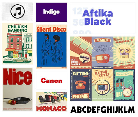

After doing some wordmark sketches and playing around with the pen tool on Figma, I came up with the perfect wordmark that showcases the fat-face and roundness of the font, while also having a music symbol attached to the O’s.

App Logo
After doing different iterations on what the app logo could look like, I ultimately ended up with this as orange is a very vibrant and retro colour that can grab the user’s attention.
Chosen App Logo


Colour Lab
The colours that I used for my brand development and hifi prototype come from the mood board. I extracted colours from the images that felt like they embodied the brand and adjusted them to match the contrast. I initially had two possible colour combination choices, but ultimately selected the one on the left.

Typography
As for my typography choices, I focused on a rounded sans-serif for the headings to make them stand out and help users identify each section. For the body text, I decided to go for something that had different weights but still be readable in its bold state. That’s how I selected Sono for the heading typeface and Pelita Grande Std for the body text
.png)
HiFi Prototype
Major Changes
Before fully injecting colour to create my high-fidelity prototype, I changed the look of my app to feel more aligned with the branding. The previous iterations were too similar to existing music apps.

I revamped the recently played section to be smaller and give the feeling of jukebox cards. I also compressed the groups on the home page to look like they are vinyl records lined up beside each other that expand when pressed. The typography was also changed from the MidFi wireframes to the aforementioned fonts above.
HiFi Prototype
After injecting colour into the grayscale wireframes, the final product, Moody is finally ready with an additional screen at the beginning to start up the app.


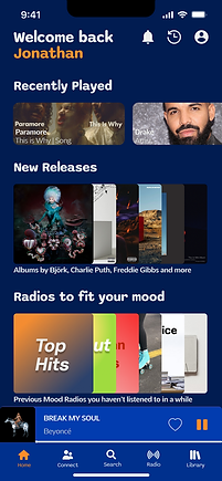
Check it out on Figma!
UI Library
This is the UI Library where all the current components are. The goal is to expand the library to include the features the app intends to have.
These are broken down into:
-
Foundations
-
Atoms
-
Molecules
-
Organisms
-
Templates
-
Pages


Check it out on Figma!
Marketing Page
I created a marketing website mockup for both Desktop and Mobile platforms. This would help prospective users figure out whether or not they would want to use the app, while also showcasing the features that the app has to offer.

Check the Desktop Version in Figma!

Check the Mobile Version in Figma!
Key Learnings
Don’t be afraid to make changes
I was worried to make any changes to my design as it might set me back. I was able to manage my time well enough to do a lot of changes and also create new animations to elevate my prototype. The iteration process never stops.
Simple may be best
I spent a lot of time trying to create animations that did not add anything essential to the marketing website and that cost me time. Sometimes doing it simply may be the best way to move forward. Don’t overcomplicate things.
The user is always right
There's no question about this. This user will know what is best and is a designer's partner throughout the design process.