PAWS Redesign
A non-profit organization that shelters homeless, abused and abandoned pets based in Toronto, Canada.
The goal of this project was to create a solution to improve web traffic for non-profit organizations and transparency in non-profit donation processes. Check out PAWS at: https://www.pawscanada.org/
Project Length: 1 week
Project Type: Website
Softwares used: Figma, InVision, Photoshop
The Problem
Problem Statement
As a non-profit, the organization primarily depends on monetary donations. Canadian donations over the last two years have declined by 12% due to inflation and the pandemic.
With this in mind, the task was to revamp the current PAWS website and make it more accessible to potential donors, adopters, and the general public.
We observed the current state of the website and tried to navigate to the donation process and found several misleading and confusing prompts that were aligned when we conducted some interviews.
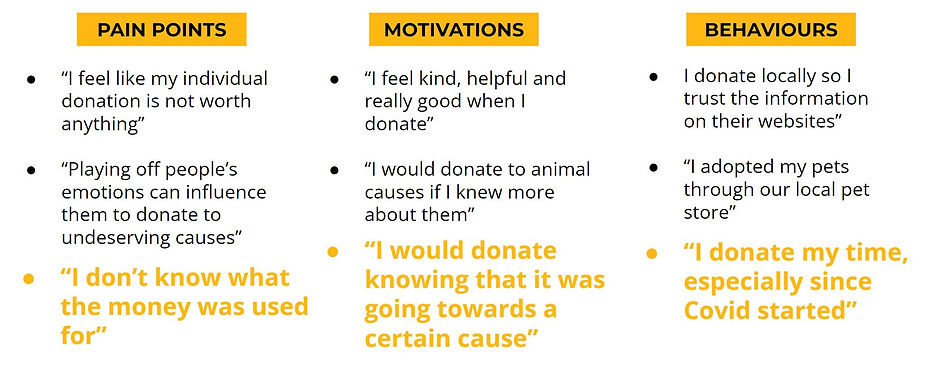
The consensus was that people are less inclined to donate when they are unsure of where the money actually goes.
How Might We Statement
This led to the how might we statement:
“How might we create a more transparent donation process with PAWS’ organization in order to gain the trust of millennials and motivate them to donate?”
The Current Website
When going through the current PAWS website, we found it useful to list down what worked about the site and what did not, in order to better understand what needs to improve and be kept.

What didn’t work:
-
Very outdated
-
Too much going on the home page
-
Too many donate buttons or links
-
Use of space is not used well
-
Small text
-
Text heavy
What worked:
-
Pictures of the animals
-
Missions and Goals
-
Strong community
-
Money usage
-
Purpose of donations
Design Process
The sketches we did reflected what we thought would work best for people visiting the site. We wanted people to see the animals of PAWS and present the information in a direct way that shows the cause.
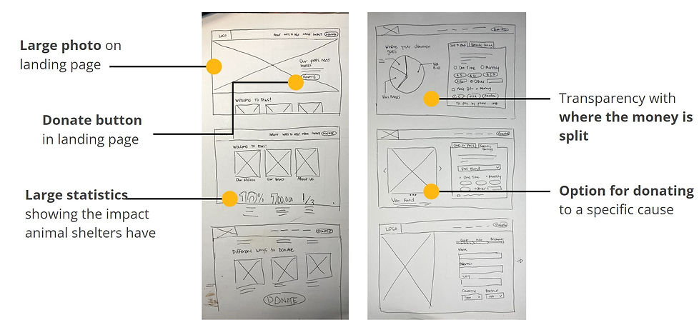
To design the revamped website, we chose to retain the core colours of the original website to maintain its core identity and not make frequent visitors feel that PAWS has changed, while simultaneously attracting potential donors.

These colors are used to make the website more simple and follow the 60-30-10 rule that will help people navigate the site with ease and look visually appealing at the same time.
User Testing
User testing was conducted in order to find out what about the website is unclear and can still be improved. Using our prototype, we were able to gather the following results.
1. Donate button is different from the other donate buttons
2. Credit card button doesn’t stay highlighted
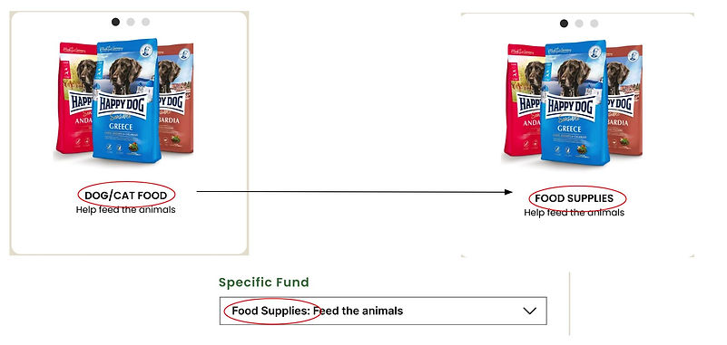
3. Match the name of the photo and selection in the drop-down menu
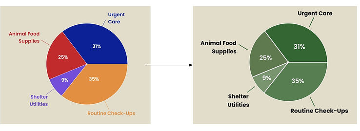
4. The pie chart contains too many colours
5. The titles of the pie chart are too small
Donate button is different from the other donate buttons

Credit card button doesn't stay highlighted

Before
After
Match the name to the photo based on drop-down menu
Pie chart has too many colours and is hard to read
Before
After
Final Prototype
This is the final prototype of the updated PAWS website
Marketing Page
.jpg)
Home Page

Donation Page

Donation Page w/ Payment Info
.jpg)
Check it out on Figma!

Key Learnings
Testing is integral
We found that the more tests we conducted, the more improvements we were able to make. This is essential in developing any product and trust between users and developers.
Time management is essential
A lot of unnecessary animations and experimentation was tried and was not able to be implemented in the website. As a designer, it is important to manage one's time in focusing on the task at hand.